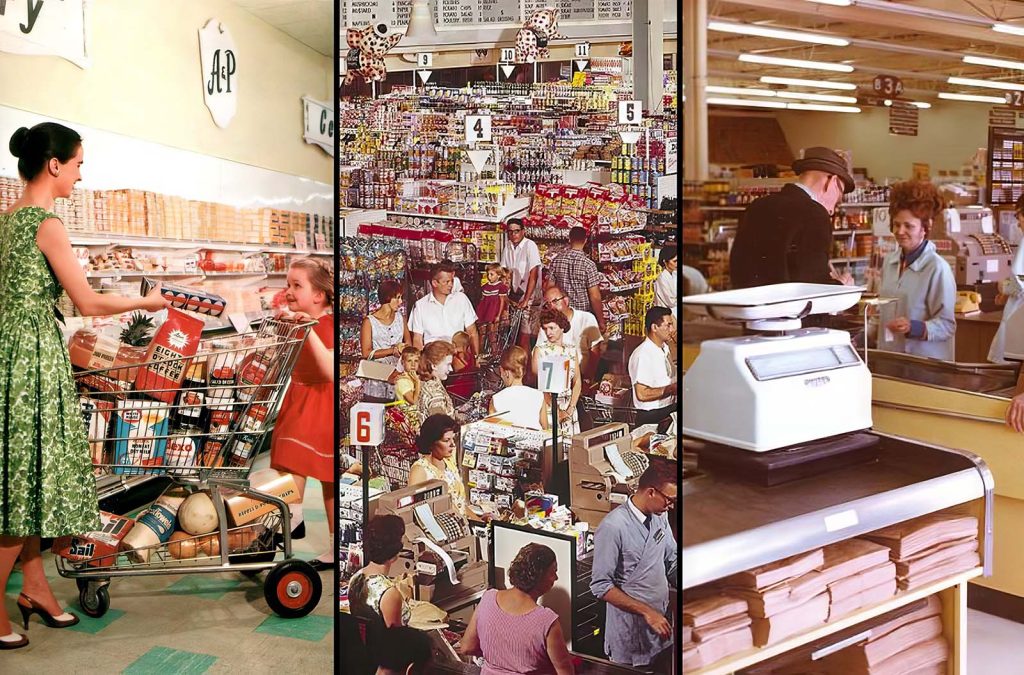
Unlike traditional stores that offered limited dry goods, King Kullen provided customers with thousands of products, all conveniently located under one roof.
It introduced new conveniences such as a bakery section with freshly baked bread, a meat department with skilled butchers, and a large produce department—all accessible through a single checkout line.
Rather than focusing on fancy decor, merchandise was simply displayed in packing cartons.
The emphasis was on efficiency and volume, with this one store projected to match the sales of up to one hundred typical chain stores.
This approach allowed King Kullen to offer significantly lower prices to its customers.
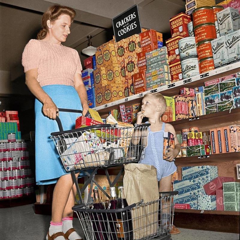
Cracker section, 1955.
As time progressed, larger chains also embraced the idea, refining it with a level of sophistication previously absent in the simplistic stores of the early 1930s.
In the late 1930s, A&P embarked on a strategy to consolidate its numerous small service stores into larger supermarkets.
This involved replacing multiple smaller stores with one larger, more modern establishment. By 1940, despite halving its store count, A&P experienced a significant increase in sales.

Woolworths Department Store, Southbridge, circa 1953.
The 1950s and 1960s are often hailed as the heyday of supermarkets. During this time, bright new stores popped up regularly, drawing enthusiastic attention from newspapers and catering to a growing population of wealthier shoppers.
The designs of these supermarkets, which had been standardized since the 1930s and 1940s, were refined and updated.
This led to the creation of iconic buildings like A&P’s colonial-themed stores, Safeway and Penn Fruit’s distinctive glass arch-shaped designs, and Food Fair and Lucky Stores’ towering pylon signs.
Even today, the modernist stores introduced by Steinberg in Ontario and Québec continue to make a striking impression, despite being rebranded as Provigo, Food Basics, and Metro.

Kroger and the local strip mall, 1955.
In the late 1960s, changes in consumer preferences and zoning regulations led to a shift towards more subdued exteriors for supermarkets.
To compensate, store interiors adopted colorful designs inspired by New Orleans, the happy palettes, or old farmhouses, moving away from the stark whites of the 1950s.
Other upgrades included carpeting, specialized departments, and more.
Kroger’s introduction of the “superstore” prototype in 1972 was a highlight of this trend, featuring specialty departments and a vibrant color scheme of orange, gold, and green.
However, some shoppers were concerned about the potential costs of these enhancements, leading to a growing backlash. This led to the emergence of a new trend in the late 1960s called “discounting.”
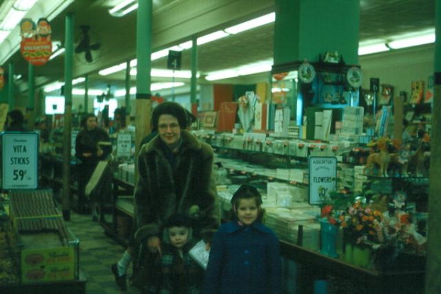
Woolworths Department Store, Southbridge, 1950s.
During this period, numerous stores across the country began offering discount programs. These programs typically involved getting rid of trading stamps, reducing operating hours, and prioritizing cost-cutting measures.
Lucky Stores in California simply updated their existing stores while keeping the same name.
Meanwhile, others took a hybrid approach, with some stores operating as usual and others, like Colonial’s Big Star stores and Harris Teeter’s More Value in the southeast, running as discounters under different names.
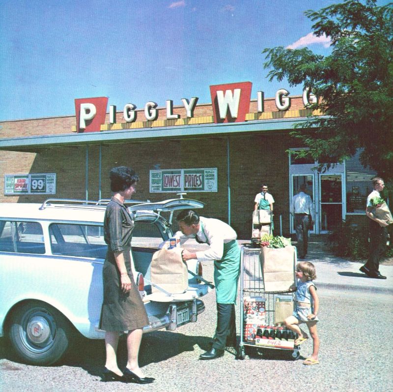
Mother shopping with daughter at Piggly Wiggly, circa 1960s.
The market segmentation we observe today evolved from the discounting trend that gained traction in the 1980s.
During this period, the middle range of stores began to diminish gradually.
Mainline stores started leaning towards more upscale offerings, while lower-end stores shifted towards a warehouse-style approach reminiscent of early 1930s supermarkets.

In Canada, Loblaws led the way with its No Frills franchises, frequently found in former Loblaws locations.
Additionally, the Oshawa Group introduced Price Chopper warehouse stores in many Safeway locations it had recently acquired in Ontario.
Conversely, some companies opted to eliminate one end of the market entirely. For instance, Harris Teeter in North Carolina completely abandoned discounting.
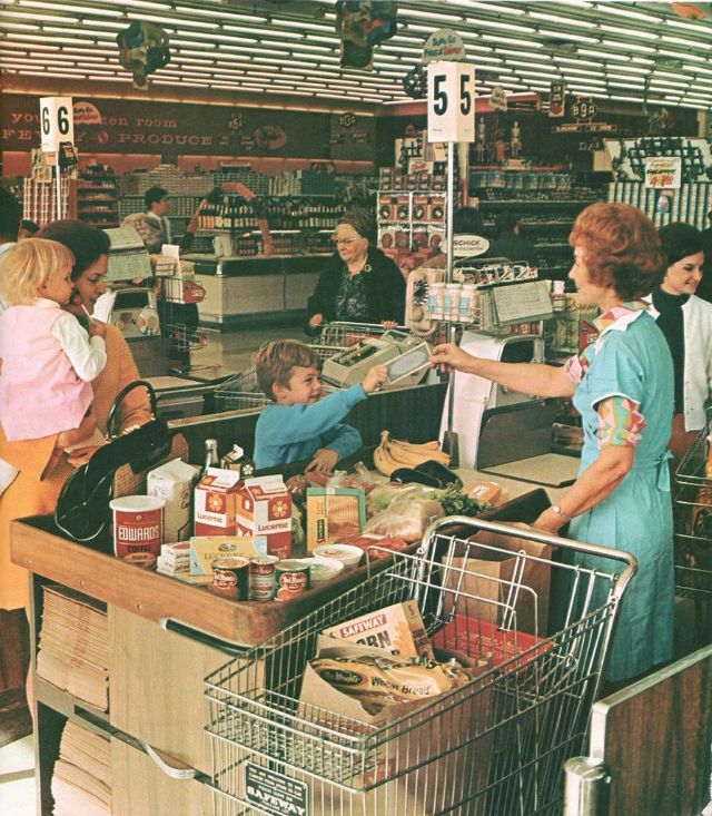
Paying for groceries, circa mid-1960s.

Picking out oranges, 1962.

Dallas Kroger’s, 1965.
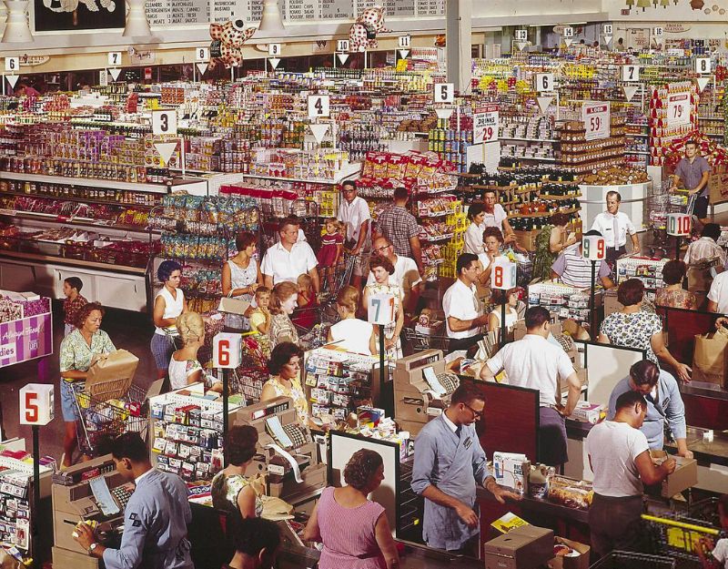
Family shopping at the local supermarket, 1966.
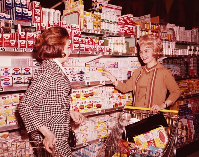
A supermarket in 1960s.
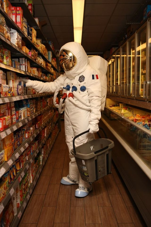
A promo shot in a French supermarket, 1967.

Food shopping, 1968.
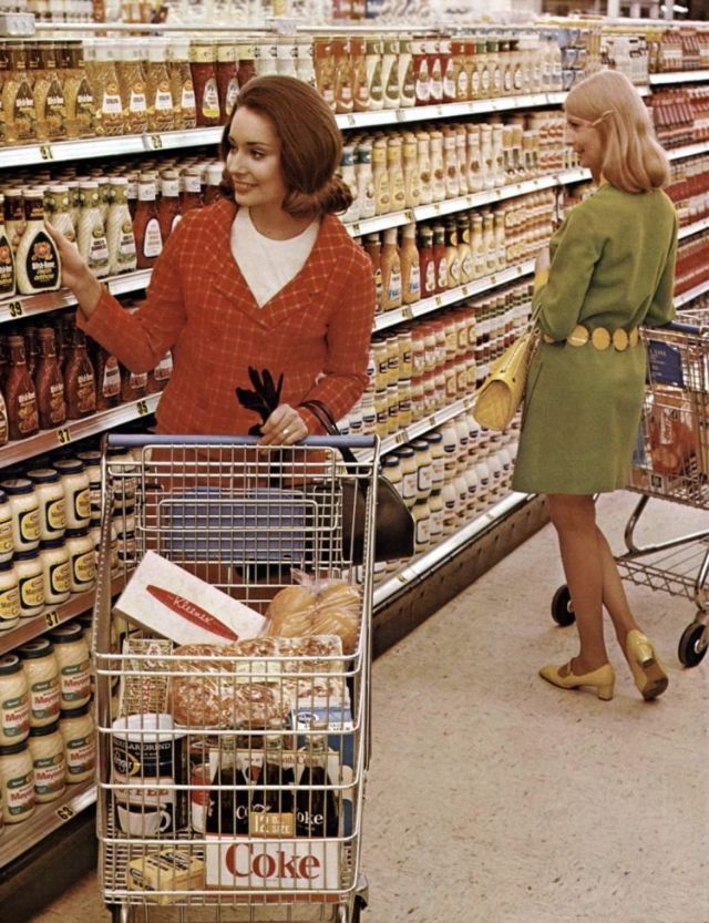
Kroger store, 1968.
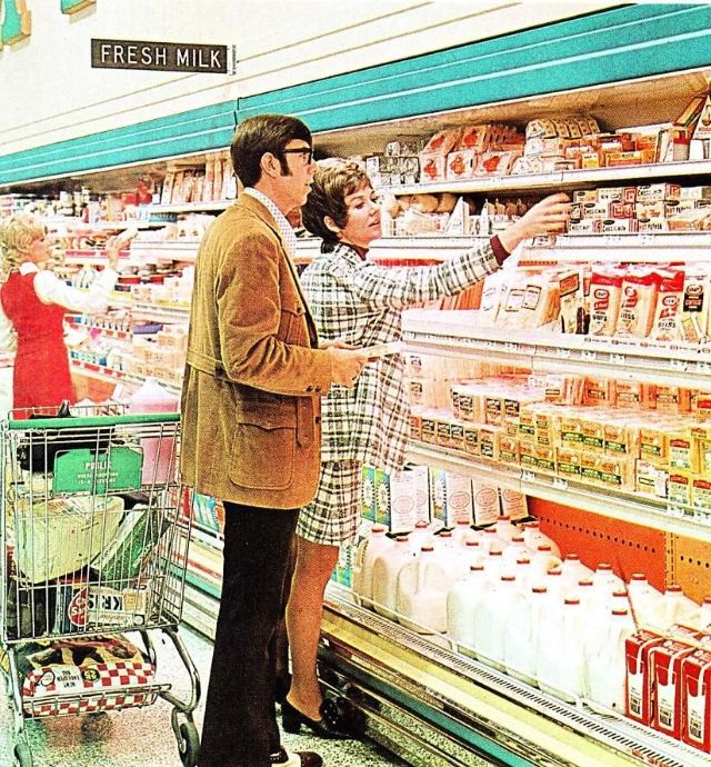
Couple in dairy section, 1969.
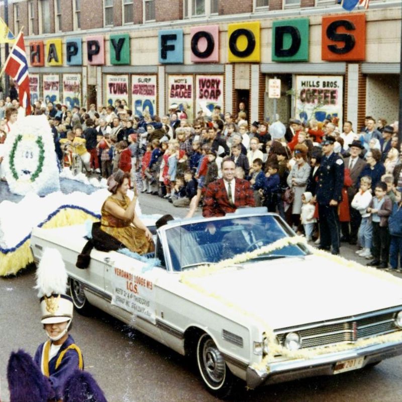
Happy Foods parade, circa late 1960s.

Food shopping and mini-skirts, 1970.
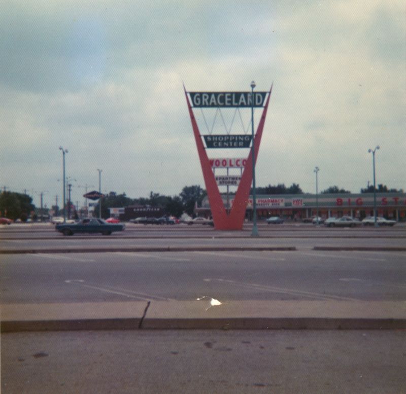
Graceland shopping center, circa 1970s.
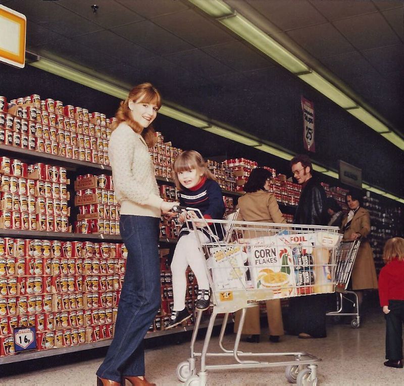
Grocery shopping in the 1970s.
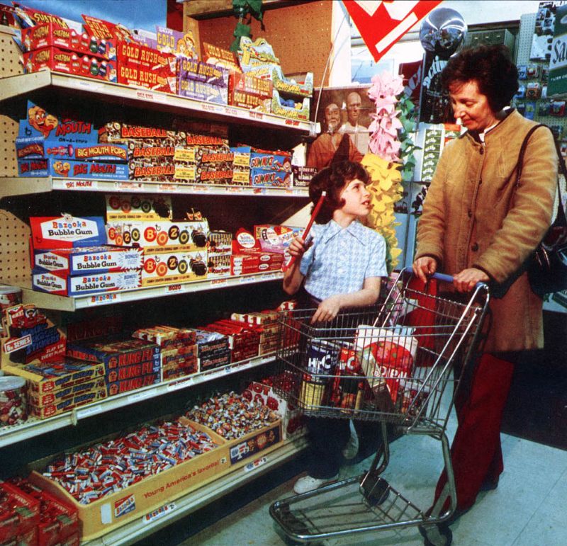
Shopping with grandma (Bazooka Gum!). Also original “Kung Fu” TV Show poster in background, circa 1970s.
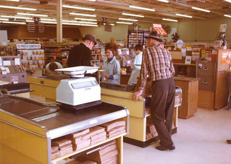
Checkout lane, 1972.
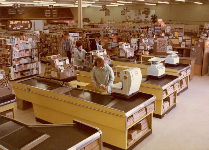
Checkout lane, 1972.
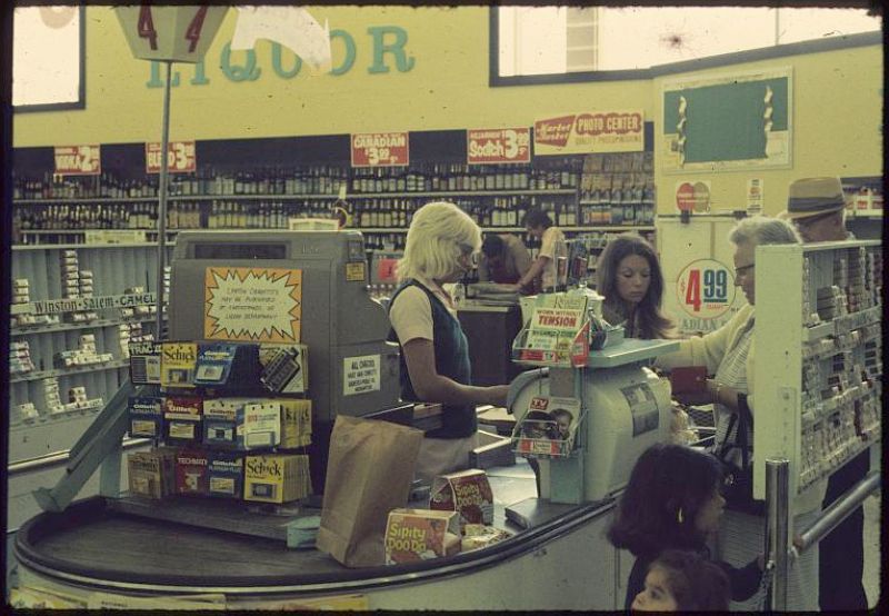
Checkout lane, 1972.
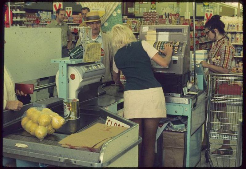
Checkout lane, 1972.
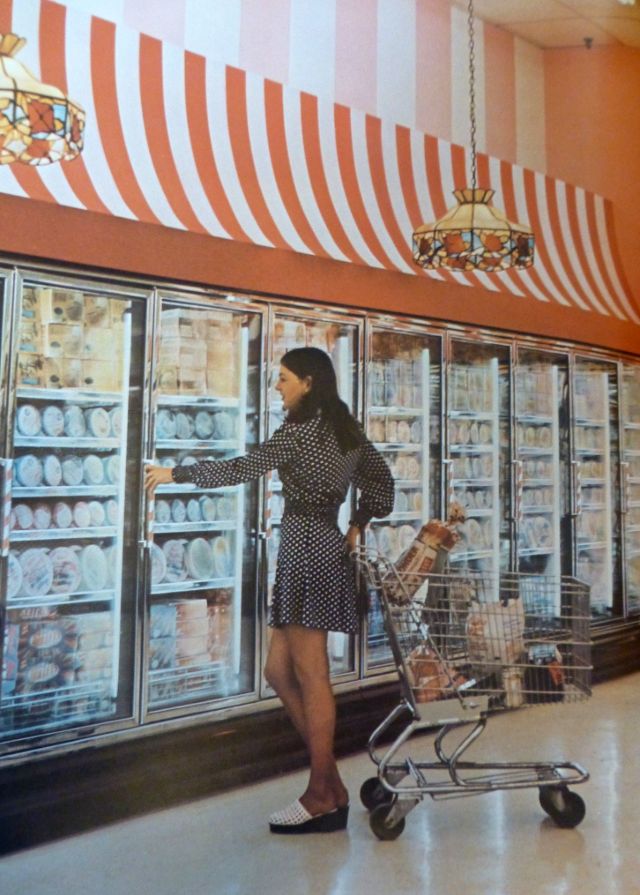
Ice cream section, 1973.
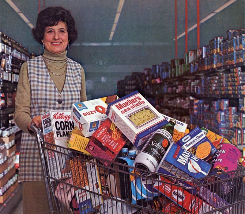
A promotional photo from 1974.
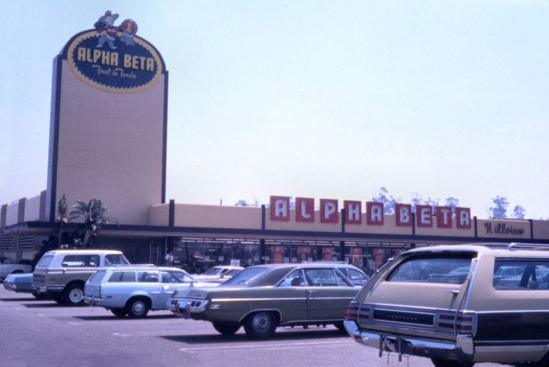
Alpha Beta supermarket, 1975.

Shopping for groceries, 1975.
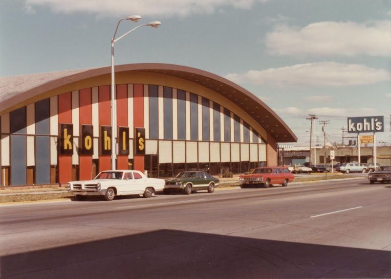
Kohl’s supermarket, 1976.
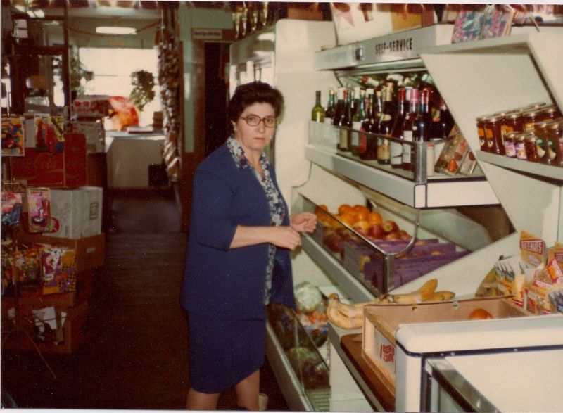
Shopping in wine section, circa 1976.
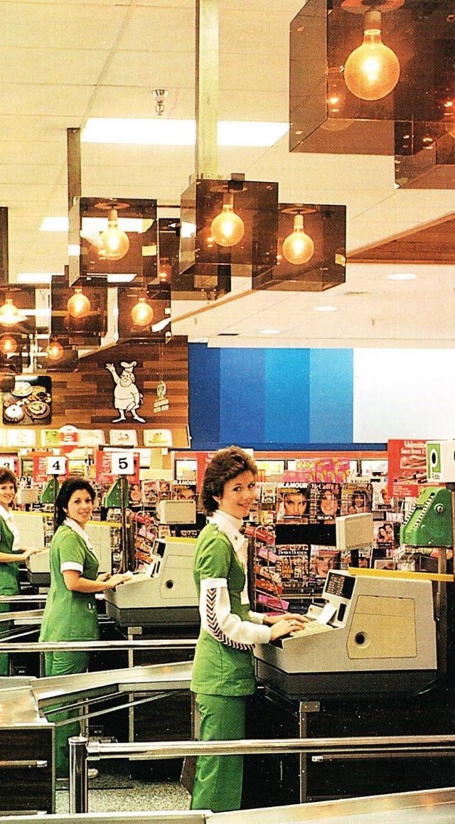
Supermarket checkout lanes, 1976.
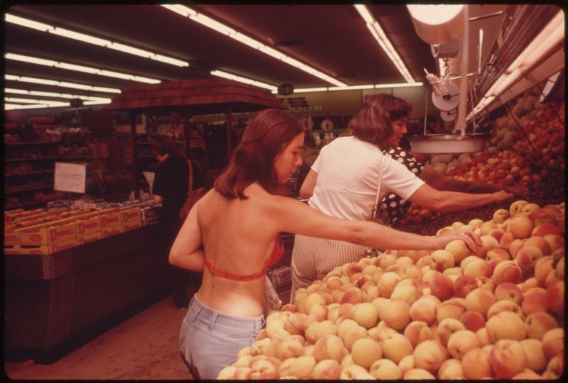
Shopping for peaches in a halter top, 1977.
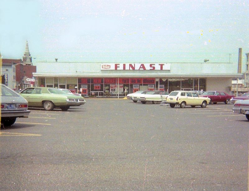
Finast supermarket, circa 1980s.
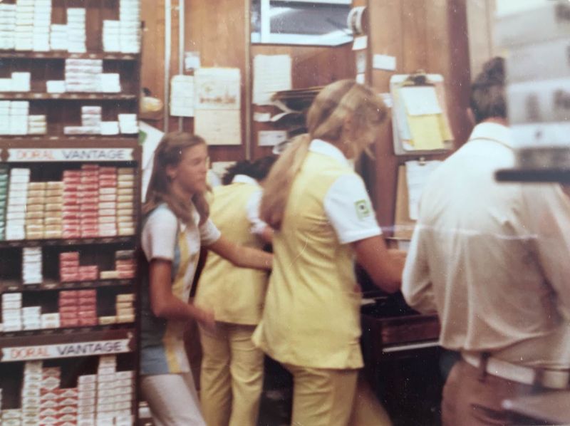
Supermarket cashiers, 1980.
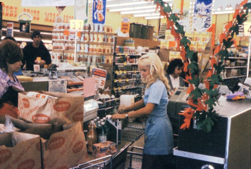
Check out lane, 1981.

Fruit section, 1981.
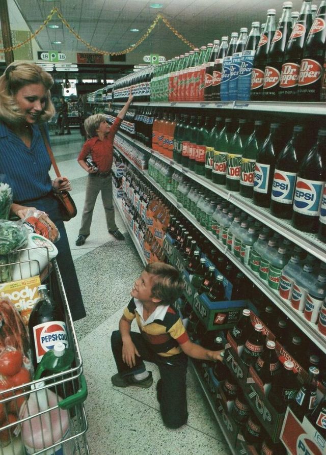
Shopping for pop, 1982.
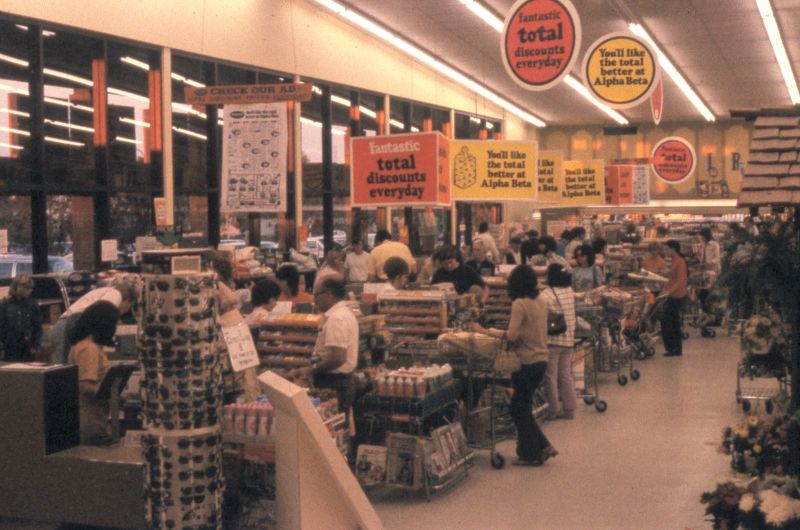
“Total Discounts Everyday!”, 1984.
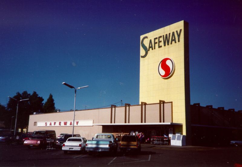
Safeway, 1989.
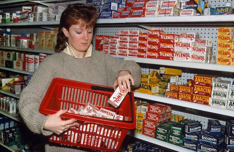
Stocking Tylenol, 1983.
(Photo credit: Flickr / Pinterest / Wikimedia Commons / FB Archives).
