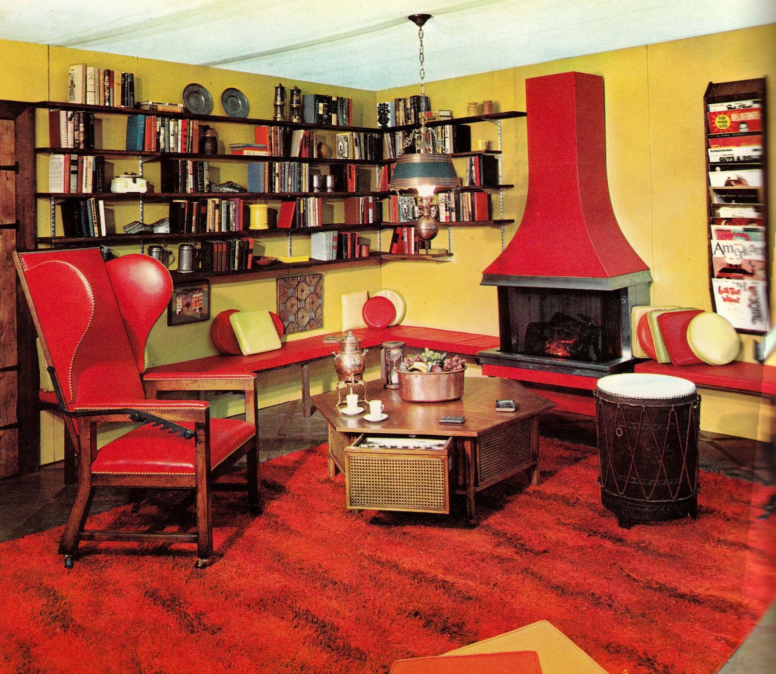
The majority of homes in the 1960s were furnished with an eclectic mixture of furniture from a variety of periods, featuring large, bold images, such as posters and brightly decorated bedspreads and window blinds set against brightly colored walls.
Green, (such as pea green and drab), yellow, pink, and orange (such as peach and saffron) hues were popular for wallpaper, carpets, curtains, sofas, chair seats, and cushions, often with patterns or bright flowers.
English decorator David Hicks was an important influence on interiors in the 1960s, inspired by bright colours associated with India.
Hicks popularized use of “psychedelic patterns and acid-edged colors,” peaking in the period 1967–1973, a time when there was interest in the Hippie movement and “flower power.”

In the same era, Dorothy Draper, one of Manhattan’s top interior decorators of the 1960s, used ‘dull’ white and ‘shiny’ black as one of her favorite combinations.
As a furniture material, polypropylene, which was manufactured in colors that could be matched to paint chips, came into its own.
Foam molding, mostly used as upholstery cushions, became a basic structural unit for furniture in the early 1960s.
Large areas, such as sofas, beds, carpets, drapes and wallcovers, were covered in vibrant colors and patterns. Employing “psychedelic intensity”, the colors and styles were influenced by India, Spain, and the Mediterranean.

In the 1950s and 1960s, specialized patterns in wall painting were developed. Sherwin-Williams manufactured an Applique system and similar systems were manufactured by Karl Höhn, also Reuss, in Germany.
Many hotels and restaurants retain their décor from the 1960s or specifically employ Sixties-style features to give them a more nostalgic sensibility.
Pink or orange paintwork, bedspreads, and curtains, which were fashionable in the 1960s, however, were considered by some to be “hideous” or “painful” by the early 2000s.
As Paul Evans put it, “For many, the popular image of 1960s home design was of ephemerality and excess, of plastic or paper chairs and lurid carpets and wallpaper.”
By the 2020s, however, many of these previously-loathed styles and colors came back into fashion with movements such as cottagecore, spread on social media platforms.

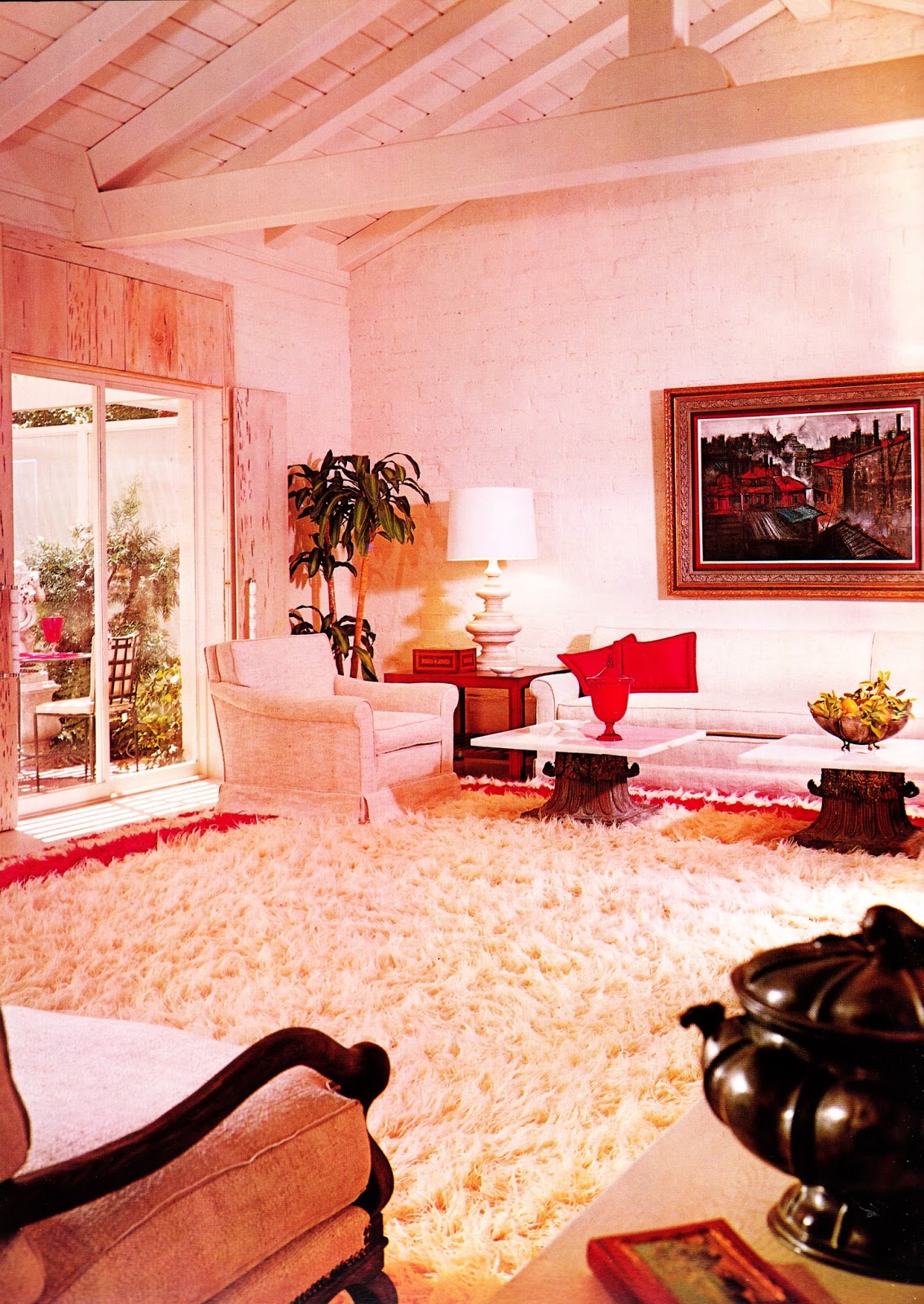
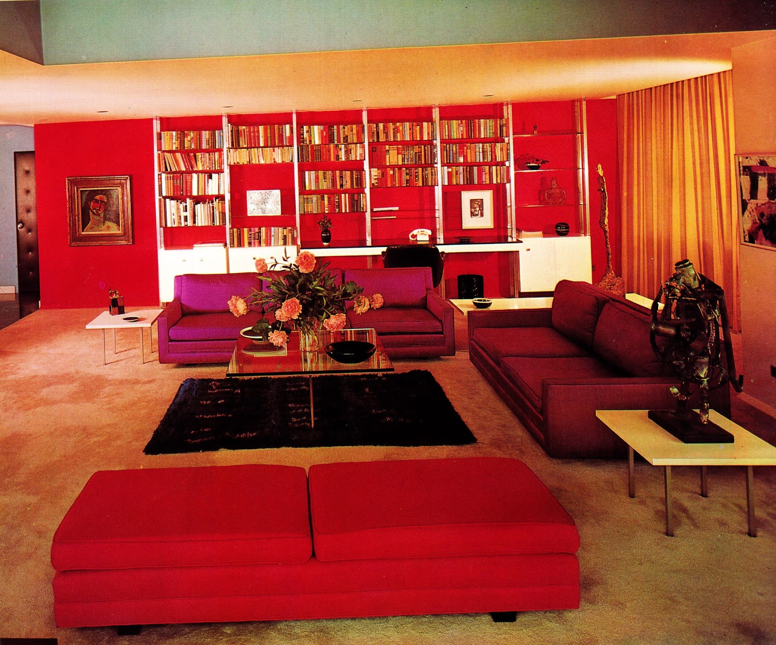

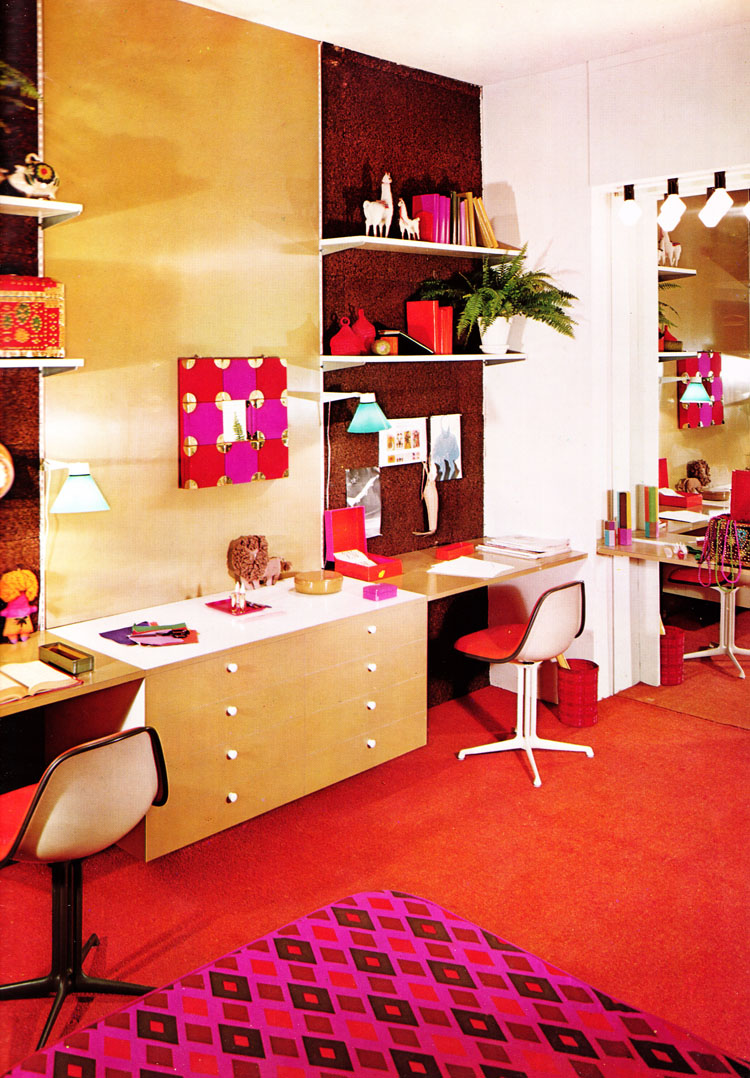


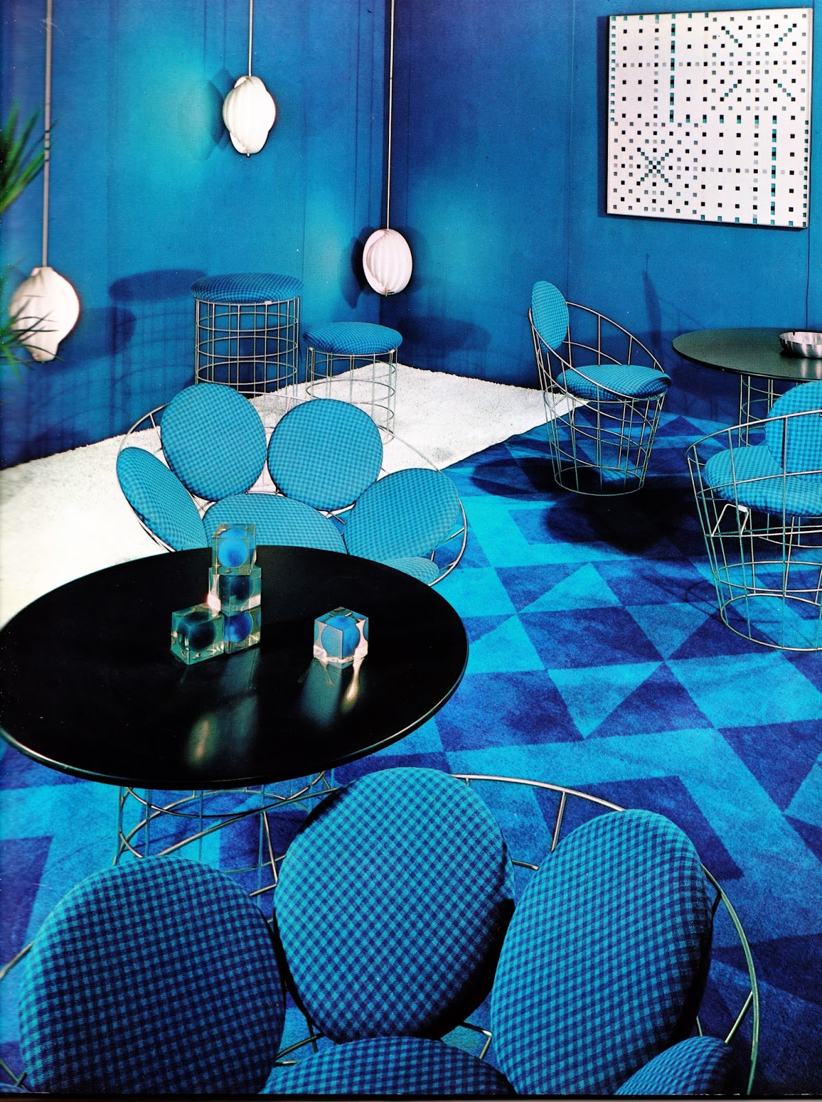


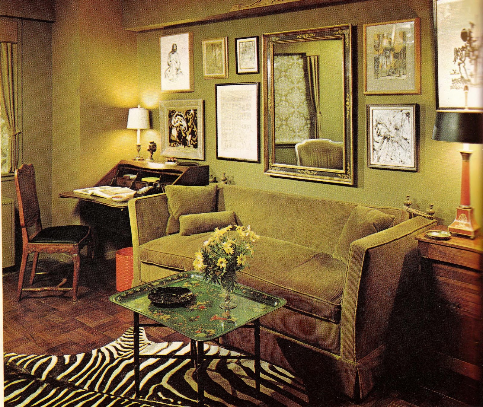


(Photo credit: Pinterest / Flickr / Wikimedia Commons).
These Photos Show The Bold and Groovy Home Interior Décor of the 1960s
Green, (such as pea green and drab), yellow, pink, and orange (such as peach and saffron) hues were popular for wallpaper, carpets, curtains, sofas, chair seats, and cushions, often with patterns or bright flowers.
English decorator David Hicks was an important influence on interiors in the 1960s, inspired by bright colours associated with India.
Hicks popularized use of “psychedelic patterns and acid-edged colors,” peaking in the period 1967–1973, a time when there was interest in the Hippie movement and “flower power.”

In the same era, Dorothy Draper, one of Manhattan’s top interior decorators of the 1960s, used ‘dull’ white and ‘shiny’ black as one of her favorite combinations.
As a furniture material, polypropylene, which was manufactured in colors that could be matched to paint chips, came into its own.
Foam molding, mostly used as upholstery cushions, became a basic structural unit for furniture in the early 1960s.
Large areas, such as sofas, beds, carpets, drapes and wallcovers, were covered in vibrant colors and patterns. Employing “psychedelic intensity”, the colors and styles were influenced by India, Spain, and the Mediterranean.

Many hotels and restaurants retain their décor from the 1960s or specifically employ Sixties-style features to give them a more nostalgic sensibility.
Pink or orange paintwork, bedspreads, and curtains, which were fashionable in the 1960s, however, were considered by some to be “hideous” or “painful” by the early 2000s.
As Paul Evans put it, “For many, the popular image of 1960s home design was of ephemerality and excess, of plastic or paper chairs and lurid carpets and wallpaper.”
By the 2020s, however, many of these previously-loathed styles and colors came back into fashion with movements such as cottagecore, spread on social media platforms.


(Photo credit: Pinterest / Flickr / Wikimedia Commons).
